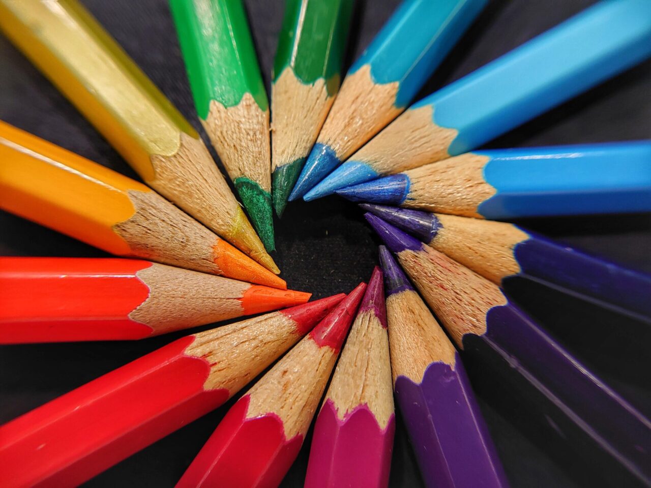
There is an abundance of research on colour theory and how certain colours can make you feel. This has been proven over and over in studies and these findings are mirrored in the how marketing brands and imagery are planned.
Interestingly, there is less research on the effect of colour on actual behaviour changes. One could argue that they are intrinsically connected and, therefore, no one would do anything without having a feeling that provokes their actions or behaviour, but this idea is considering things at a very deep human level.
What is it about colour that can change behaviour at a more superficial and subconscious level?
First, let’s review the basics on colour theory and how certain colours make us feel:
Red = excitement and energetic
Blue = calm and tranquillity
Yellow = sunshine and positivity
Orange = warmth and enthusiasm
Green = Fresh and rejuvenating
Purple = creativity and luxury
Now, try to think of some brands that you associate with each colour – we’ll start you out with Coca-Cola = Red.
Looking back at the feelings that the colour Red is meant to stimulate, according to colour theory, does this match? Does Coca-Cola make you think of something exciting and energetic or is it a stationary and sturdy brand that portrays sophistication? If they wanted to portray sophistication and professionalism, would they choose a different colour altogether?
Now try this for the other brands and see whether the brand matches the colour they’ve chosen in their logo and design. In most cases this links relatively well. At this point, all we’ve proven is that colours have the potential to make us feel a certain way.

So what does that have to do changing our behaviour and promotional products?
The more positive we feel about something, the more likely we are to engage with that something. This idea can apply to anything from the sports teams we support to the café we go to for our morning cuppa. If asked, we would most likely attribute our feelings about the places or things we choose to support due to the location and the performance of those things, but is it more than that?
If your favourite sweets were branded a different colour, would they taste the same?
For example, think of Cadbury as a very distinct brand. Specifically, the Dairy Milk brand is a distinct, deep Purple colour that screams luxury. Bournville chocolate is also a Cadbury brand, but it’s presented in Red packaging. Not only is Bournville dark chocolate rather than milk chocolate, but the brand is so different that some people forget they are both Cadbury products. The company have distinctly separated these product lines by colour before any other branding is even considered. This reinforces the feelings that Cadbury want to create around their Dairy Milk product line as ‘separate’ and ‘special’ in all their marketing.
You could argue that more people like milk chocolate compared to dark chocolate, and this is why Cadbury’s has focused on one over the other, but regardless of their reasoning, the overall branding of Cadbury, not just the Diary Milk, leans heavily on the rich, luxurious Purple colour and very little towards the Red colour.


The use of colour in product design is a well thought-through process that helps customers to understand the values and personality of a brand. Colour may be subtly used within the design of products or it can shout at you from the shelves depending on how it’s used.
Between 80-90% of company logos are designed in colour. The strength of colour as a language that speaks to us is proven as many companies build their brand through promotional products and reinforce their colours from their logo in every detail of every product they produce.
Some promotional products are even sold and grouped by colour rather than by product type, thus reinforcing the importance of colour alone as a driving factor for purchase and consumer behaviour.


